With the eye-catching Wintouch Dashboard you can display your custom reports in pie chart, bar graph, or tabular view with a single click. This customizable dashboard gives you, at a glance, the information that is most vital to monitoring your business performance.

You select the custom reports you want displayed on your dashboard to give you a snapshot of key performance indicators.
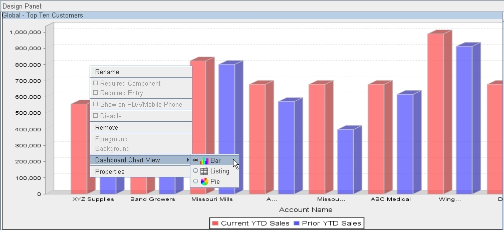
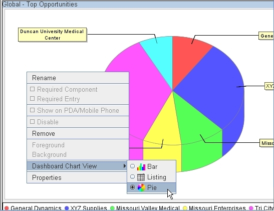
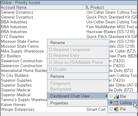
Use the Click and Drag feature to add custom reports to your dashboard and arrange them in the design panel. Once there, right click on each custom report display to choose bar graph, pie chart, or listing view, rename the report, or change properties.
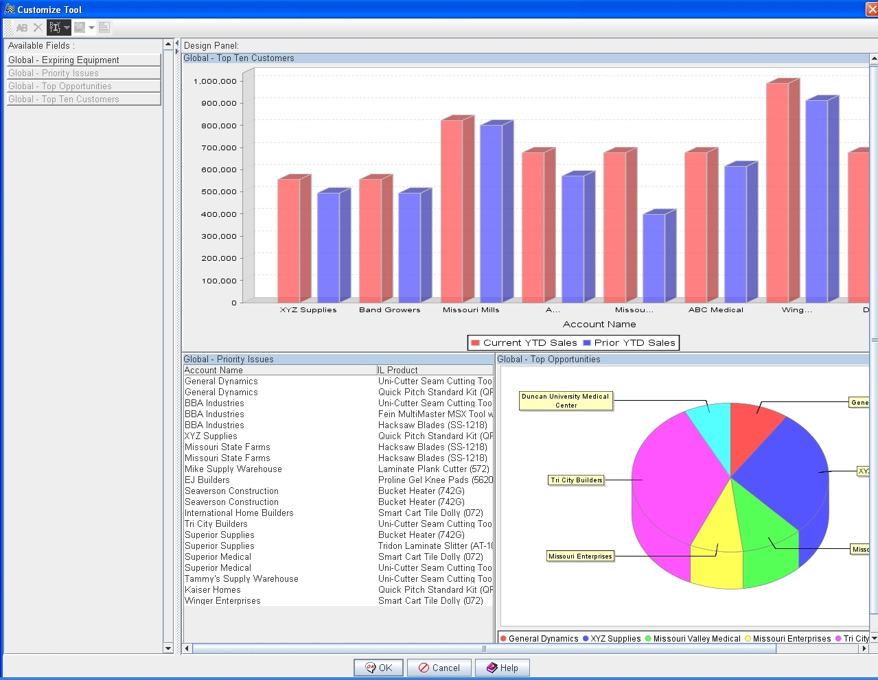
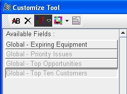
The available fields for the Wintouch Dashboard are your custom reports. Any of the custom reports available to you can be displayed on your dashboard, giving you a graphical representation of your most frequently run reports.
The Wintouch Dashboard offers three display options for the custom reports you select: bar graph, pie chart, and listing view.